Student lists
for teachers
I adapted a product, designed to enable communications between teachers, students, and post-secondary schools, by transforming its desktop version into a dynamic mobile experience.


TYPE
Module in a mobile app
MARKET
Education
LENGTH
1 week
YEAR
2023
Team
Me, as a UX Designer
2 Product Stakeholders
Skills
Initial Research
Personas
User Flows
Ideation & Sketches
Prototyping
User Interface Design
Design Presentation
A Story for Context
Let's imagine Bradley, a dedicated philosophy instructor at a bustling college. Despite juggling seven groups of students, he's committed to fostering a dynamic learning environment. However, due to the school's staffing shortages, Bradley often finds himself stepping in as a substitute teacher more frequently than he'd prefer. In his quest to ensure active participation and verify attendance, Bradley employs a personal touch by addressing his students by name. Yet, amidst his demanding schedule, he struggles to commit each name to memory as thoroughly as he'd like.
Problems
-
Educators often find themselves tasked with teaching classes where they haven't yet acquainted themselves with the students.
-
To ensure attendance, teachers typically rely on attendance lists that can be accessed through printed copies or desktop computers.
-
Not all classrooms are equipped with desktop computers, and even when available, they may not always be reliable.
-
Some students have specific needs documented in their profiles, which might not be readily visible on the standard student list.
-
The desktop application primarily caters to desktop usage, with minimal functionality translating effectively to mobile devices.
Goals
-
Empower teachers with seamless access to essential student information for effective interaction and management, anytime and anywhere.
-
Explore the concept of a mobile adaptation for a reliable school communication platform, designed to equip educators with the necessary tools for seamless student engagement, recognition, and support. Gain insights into the potential user experience and interface design of such a platform to envision its functionality and usability.
Process


Research
To meet the project's timeline and objectives, I refined the research approach by integrating design thinking principles.
Beginning with empathetic understanding, I constructed a persona using publicly available online data. This involved thorough exploration of teacher blogs, analysis of teaching-related news videos, and review of government resources detailing school environments and teaching job expectations.
Insights
Through my exploration, I discovered that:
-
Teachers face overwhelming workloads due to understaffing, exacerbating the challenges they encounter.
-
Limited access to essential resources further compounds the difficulties teachers encounter in executing their responsibilities effectively.
-
Drawing from personal experience, I observed that teachers often struggle with unfamiliar names during attendance, leading to mispronunciations and potential discomfort for students.


Insights
To address these issues, I delved into the user flows within the desktop application, meticulously examining its functionalities.
Subsequently, I delineated the tasks at hand by identifying the key requirements teachers necessitate from the application.
Additionally, I discerned opportunities to enhance their workflows, aiming to streamline their processes and alleviate the burdens they face.
Ideas
During the ideation phase, I brainstormed various concepts, such as programming the student list to activate through voice commands or syncing it with the teacher's schedule. Due to time constraints, I refined the ideas to focus on simplicity, prioritizing the following:
-
Persistent Display of Last Accessed Student List: The module now retains the last accessed student list until manually changed by the teacher, ensuring continuity and convenience.
-
Inclusion of Comprehensive Student Profiles: I implemented a dedicated page featuring full student profiles, providing teachers with comprehensive information to better understand and support their students.
-
Name Pronunciation Feature: A new functionality enables teachers to listen to the pronunciation of students' names directly from their profiles, enhancing communication and inclusivity within the classroom environment.


Design
I initiated the process by crafting the user flow specifically tailored for mobile devices. Once I established a comprehensive list of all the requisite pages, I meticulously outlined the necessary components for each page.
Given the absence of a pre-existing design system, I embarked on creating every component from scratch within Figma. Drawing upon mobile design principles and adhering to the company's corporate identity guidelines, I ensured consistency and coherence throughout the design process.
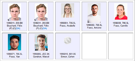
Key pages
The project necessitated the creation of two essential pages:
-
Student List Display Page: This page was designed to showcase the student list, offering both grid and table views for user flexibility.
-
Complete Student Profile Page: Upon selecting an item from the student list, users are directed to this page, presenting a detailed overview of the selected student's profile.
Crucially, both pages were designed to seamlessly adapt to both vertical and horizontal orientations.


.png)
2.png)
Navigation & Customization
In addition to the student list, menus were developed to offer teachers the following functionalities:
-
Switch Class Lists: Enables teachers to seamlessly transition between different class lists.
-
Customize Information Fields: Provides flexibility for teachers to tailor the visible student information fields according to their preferences.
-
Reorder the List: Allows teachers to rearrange the order of the student list as needed for optimal organization.
Presentation
I presented the explored concepts to stakeholders, emphasizing how the application of design thinking provided invaluable insights into the challenges faced by teachers. This approach led to the development of solutions such as streamlined student list management and enhanced communication features, all geared towards empowering educators for success in today's classrooms.