Chat review
for paralegals
We added to a product helping legal professionals view, analyze, and annotate files for the discovery process, a functionality that lets them integrate chats from Slack and Teams in the same workflow.


TYPE
Section of a web app
MARKET
Law Firms
LENGTH
4 months
YEAR
2022
Team
Me, as a UX Designer
1 UX Researcher
1 Product Manager
2 Backend Engineers
2 Frontend Engineers
Skills
Data Analysis
Competitor Research
Prototyping
Usability Testing
User Interface Design
Design Presentation
Stakeholder Alignment
Coordination with Developers
A Story for Context
Let's imagine Andrei who works on a document review team at a law firm. An attorney asks him to read documents for a case. He has to identify the ones that are relevant to the story the firm wants to tell, the ones that no one outside the firm should have access to, mark them with tags, and report back to the lawyer handling the case. Some of these files are chats, and he’s not sure how to handle them.
Problems
-
Chat files only recently became an important part of any corporation’s digital information store.
-
It can be mandatory to produce chat files in case of a legal issue or an internal complaint.
-
Chats can run for years, with some relevant content, and a lot of informal conversational content.
-
Emojis and reactions can add a lot of context to a conversation, but can’t be searched like keywords.
Goals
-
Create a chat file review interface that fits in the flow of an existing document review platform so that all digital files can be reviewed during the same process while accounting for their specific requirements.
Process

Research
Before I joined the project, a former member of the UX team had already laid the groundwork with extensive research conducted a year prior. Interviews were meticulously carried out, and their insights were captured, recorded, and annotated for future exploration.
Upon reopening the project after a year-long hiatus, I reviewed the material meticulously sifting through each detail. Despite the passage of time, the user landscape remained unchanged, and the initial findings were still relevant.
I conducted additional competitive research to gain insights into how our counterparts navigated similar challenges.
Insights
I discovered that:
-
Even when designing an interface primarily for paralegals, it's crucial to consider the needs of lawyers who oversee and occasionally modify the paralegals' work.
-
The tag selection list available to paralegals could be extensive, sometimes spanning hundreds of options.
-
The nature of the work is highly repetitive, often requiring the application of the same tags to multiple documents consecutively.
-
Competitors were breaking down chat conversation files per year of material.
-
Only specific messages would require presentation to the judge and the opposing party, suggesting a need for selective extraction and curation.
-
Files undergo multiple reviews for various purposes, possibly containing tags that cannot be combined (eg: relevant, not relevant).


Design
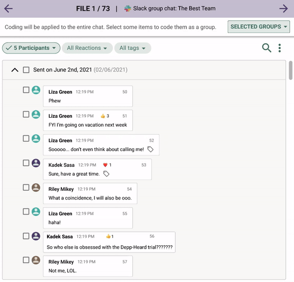
I mocked up the existing interface where digital documents are reviewed, and started mocking up ideas for viewing chats.
Segmentation
First, I organized chat conversations by segmenting them into collapsible panels, grouping all messages sent within a single day together.


Filtering
I implemented a filter menu located at the top of the screen, empowering users to refine their conversation view based on various criteria including:
-
Participants involved
-
Reactions expressed
-
Tags previously applied (if any)
-
Keywords present
Each menu item is accompanied by the count of occurrences in the file, providing users with insight into the impact of each filter on the conversation view.
To enhance user experience, an "OK" button accompanies each filter menu, allowing users to finalize their selections and instill a sense of accomplishment in their filtering process.
Message selection
Users can individually select messages, with a dynamic bar at the top of the screen displaying the current count of selected messages. Tags can be applied to any number of these selected message groups.
In the absence of any selected messages, tags are applied to the entire chat conversation, a feature clearly explained in the inactive state of the selection bar.
By clicking the button labeled 'selected groups,' users can access a panel where all previously tagged and saved message groups are displayed. This functionality allows for easy viewing and modification of tagged groups, a task that can be performed by either the paralegal or the supervising lawyer during the approval process.
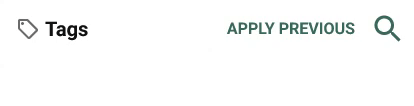
Searching tags
We've introduced a search feature within both the fields and tags sections, enabling users to quickly locate specific items without the need to scroll through extensive lists.
Additionally, we've implemented a feature allowing users to easily apply previously used tags and fields. This time-saving functionality streamlines the process, particularly beneficial when working with repetitive documents.
Saving changes
Two buttons below the tags section let the user save their changes.
The first button saves the changes and seamlessly navigates to the next file in a single click. This efficient action reduces the need for repetitive clicks, potentially alleviating strain on the hands.
The second button saves the changes while allowing users to remain within the current file. When a group of messages and tags are selected, this button saves the tagging and clears the selection, ensuring a smooth transition to tagging a new group of messages.


Error prevention
Upon saving a selected message with tags, a distinctive tag icon is appended to it. This thoughtful addition serves to prevent potential issues with tags that cannot be combined, ensuring clarity.
Testing
To test this interface for tagging chat files, I first wrote down the tasks that I wanted to ensure would make sense for users, and the steps for each of these tasks:
-
Tagging an entire chat
-
Tagging a message in the chat
-
Solve a tagging conflict
-
Edit an already tagged group of message


Moderated & unmoderated tests
I meticulously designed task-specific flows within a Figma file for conducting moderated tests and utilized Useberry for unmoderated tests.
The breakdown of my testing efforts:
-
8 unmoderated tests with internal stakeholders
-
10+ moderated tests with users.
From these tests, I collected a wealth of valuable data:
-
Qualitative insights derived from user feedback
-
Quantitative metrics such as completion rates, time on task, error rates, and overall satisfaction scores.
Design iteration
While testing, I learned that even though reapplying the tags and fields that were just used could be helpful, it could also be dangerous. As it is paramount that the files are reviewed by paralegals and not mindlessly scrolled through, lawyers were worried about that functionality, which I ended up removing.